Bill Pay Portal
With the objective of improving the user experience for Spectrum's billing process, I created a digital version of the billing statement (previously users only had access to a PDF version of the bill). As a result of the design process, I also created a bill comparison tool and a 6 month chart view that allow users to analyze and compare their expenses more effectively.
CLIENT
Spectrum
ROLE
UI/UX

It was well known by Spectrum that call centers were overloaded with calls about billing. To understand the pain points customers were having, we spent the day at a call center to listen to managers and customer representatives describe the type of calls they receive related to billing issues.
Using this information and information gathered from a competitive analysis performed by our UX researcher, I embarked on a redesign of the billing experience.
Foundational Research
The Goal
Create an easy to use interactive bill that will allow customers to self serve, thus reduce calls to customer service.
Proposed Solution
Main Business Requirement
Digital version of bill must have same data points as paper bill
To reduce customer service calls related to billing.
Paper Bill
Right about the time that I started at Spectrum a new paper bill had been designed. The previous paper bill was poorly laid out and did not have a clear hierarchy. My first task was to design a digital version of the new bill.

The New iBill
Using pre-existing elements and modules from the KITE UI kit, I iterated on possible layouts for the website and mobile apps. It was important that I design a layout that kept the bill line items and amount due as high up in the viewport as possible. An accordion pattern made the most sense for the user being able to locate a line item and drill down for more information. The desktop width allowed me to introduce a right column for amount due, a CTA for comparing statements, and Spectrum promotions. On mobile web and apps these elements were stacked below the bill.

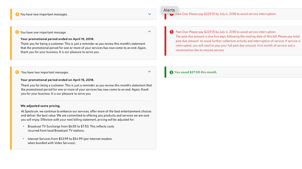
Alerts
We learned from the research the call center employees that many calls were related to:
-
Bill amount being different than previous month
-
Service interruption date
I designed alert components with varying degrees of urgency that fit nicely into the accordion based layout. These were added to the KITE UI kit.